Peterson Foundation Depicts the Long Term...Interactively
Frequent readers of this blog will be familiar with projections of long term debt. But the Peterson Foundation has found an interesting interactive way to present that informs the viewers about what the long-term outlook looks like and what the possibilities are going forward.
Peterson's presentation contains both a four minute video explaining the long-term projections and an interactive graph that allows users to look closer at the numbers. The projections appear to be based on CBO's Alternative Fiscal Scenario and show that even with the fiscal cliff deal, the sequester, and some slowing in projected health spending, debt as a percent of GDP would be on a sharply upward path over the long term. This is also true of the CRFB Realistic baseline, although the path is not quite as sharp.
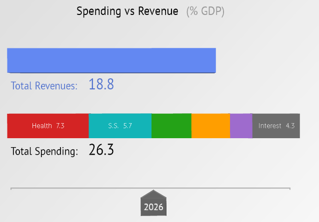
In addition to showing what the status quo looks like, the graphic also shows what the five fiscal plans presented at the Foundation's "Solution Initiatives II" last November do to the debt. As we said last year, all of the plans at least stabilize the long-term debt and generally put it on a downward path. Each plan's label also links to a full description of the policies involved, so viewers can see how the plans got to where they are. The interactive also includes a sliding breakdown of spending and revenue projections over the next 40 years, convincingly showing the growth of entitlements.
The new presentation is a helpful resource for understanding the long-term projections and what some think tanks have proposed to change them. You can see the video and graphic here.