Graphs, Graphs, Graphs: Comparing the FY 2013 Budgets
Just in case the whirlwind of plans out last week gave you a headache, the Bipartisan Policy Center has a number of comparisons for all the alternative budgets that have been presented for FY 2013. See, for example, this page which includes the Cooper-LaTourette budget, the House Democratic budget, and the House Republican budget alongside the President's budget, Domenici-Rivlin, and Simpson-Bowles. They also do a comparison involving the Progressive Caucus budget and the major plans.
These pages are useful not only for comparing spending, revenue, and debt numbers, but also for different parts of the budget such as defense or health care. For example, the graph below shows non-defense spending as a percent of GDP under various plans.
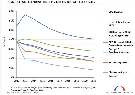
BPC's comparisons are helpful for showing not only topline fiscal numbers, but also for showing the relative priorities for each plan. Be sure to check these pages out to keep all the plans straight...or maybe to confound you even more.
What's Next
-
Image
-

-
Image