CBO Rolls Out Four New Budget Infographics
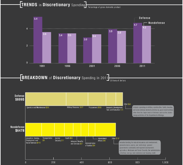
More often than not, pictures can demonstrate a problem or issue better than the raw data can. CBO has taken that to heart and recently released four detailed infographics showing visualizations of three distinct parts of the federal budget -- detailing revenues, discretionary spending, and mandatory spending -- and one on the Supplemental Nutrition Assistance Program, more commonly referred to as the food stamp program.
From the revenue infographic, one can clearly see the reduction in federal revenues over the last several years as a result of the 2001/2003/2010 and other tax cuts, as well as the economic downturn. The discretionary spending infographic shows the declines in the 1990s due to spending caps, and the subsequent rise from 2001 to 2011 due to the lack of caps and war spending. But perhaps the most telling figure details the increase in mandatory spending, especially in the area of health care where we are spending 2.9 percent more as a percentage of GDP.
Tags
What's Next
-
Image
-
Image
-